Juan Pablo Márquez Gómez
Brand Identity – Logotype Design
Juan Pablo, a legal professional specializing in promotion and liquidation, required a visual identity that could seamlessly bridge two distinct needs: serving as a marketing asset for his professional services and acting as a formal signature on binding contracts.
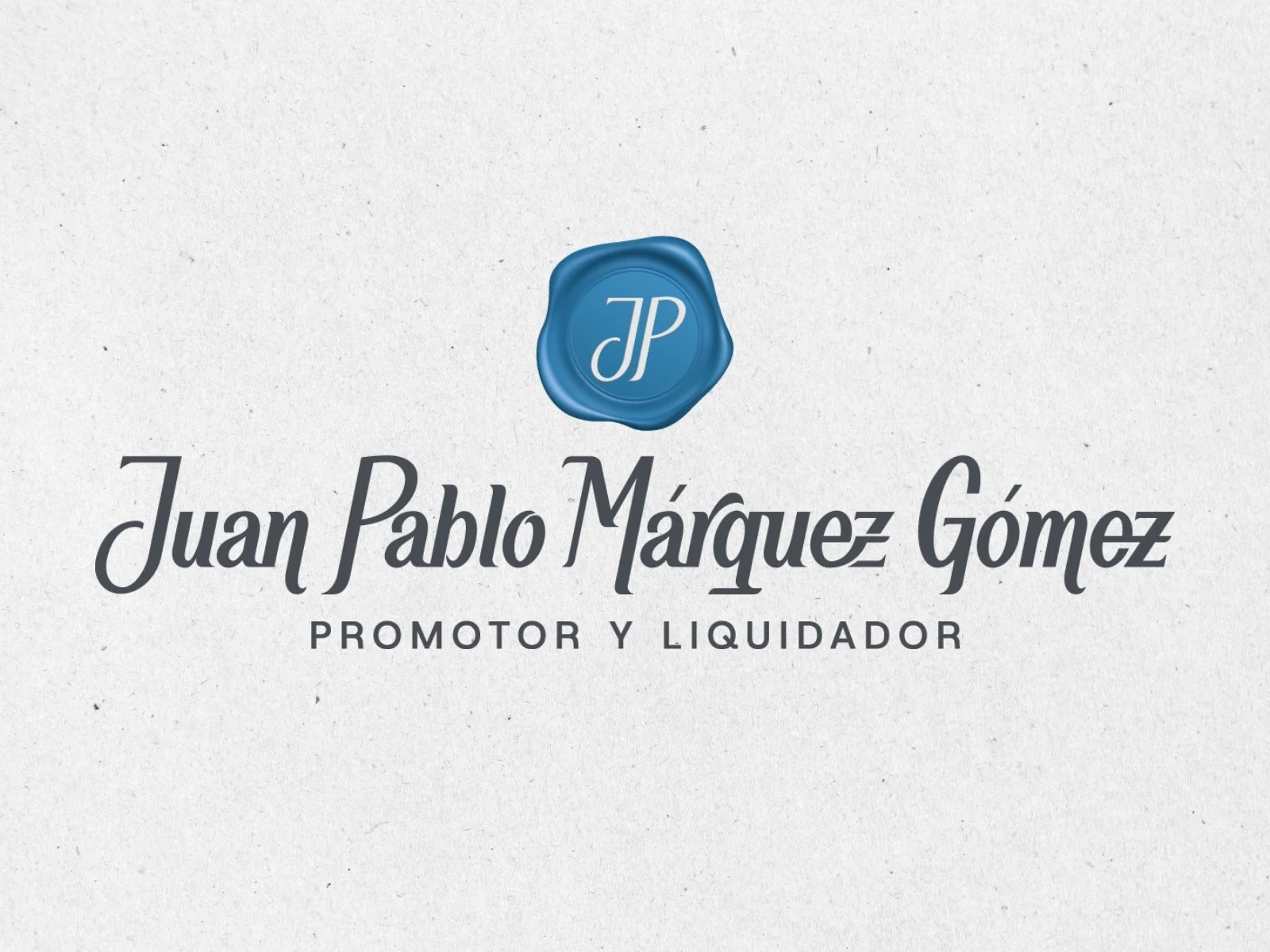
In an industry often saturated with generic, corporate templates, we opted for a highly intentional, human-centric approach. Bypassing off-the-shelf commercial typefaces, I developed a fully custom lettering signature designed entirely from scratch. Through deep-dive conversations and strategic research into Juan Pablo's professional ethos, I crafted letterforms that balance legal authority with his unique personal character.
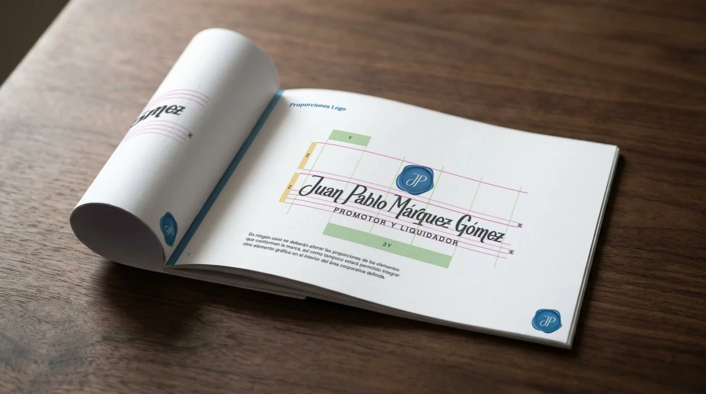
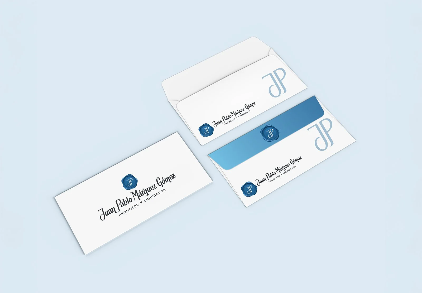
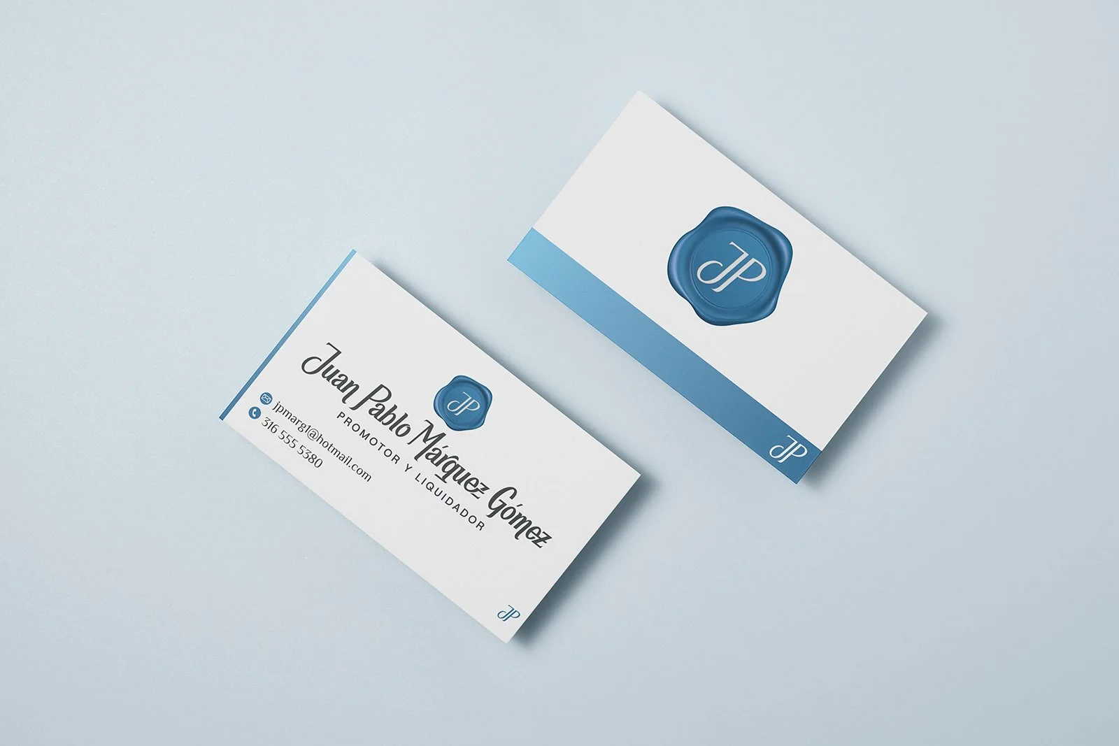
To complement the primary signature, I also designed a secondary brand mark—a modern interpretation of a classic wax seal bearing his initials (JP)—which reinforces concepts of authenticity, steadfastness, and ethical commitment.
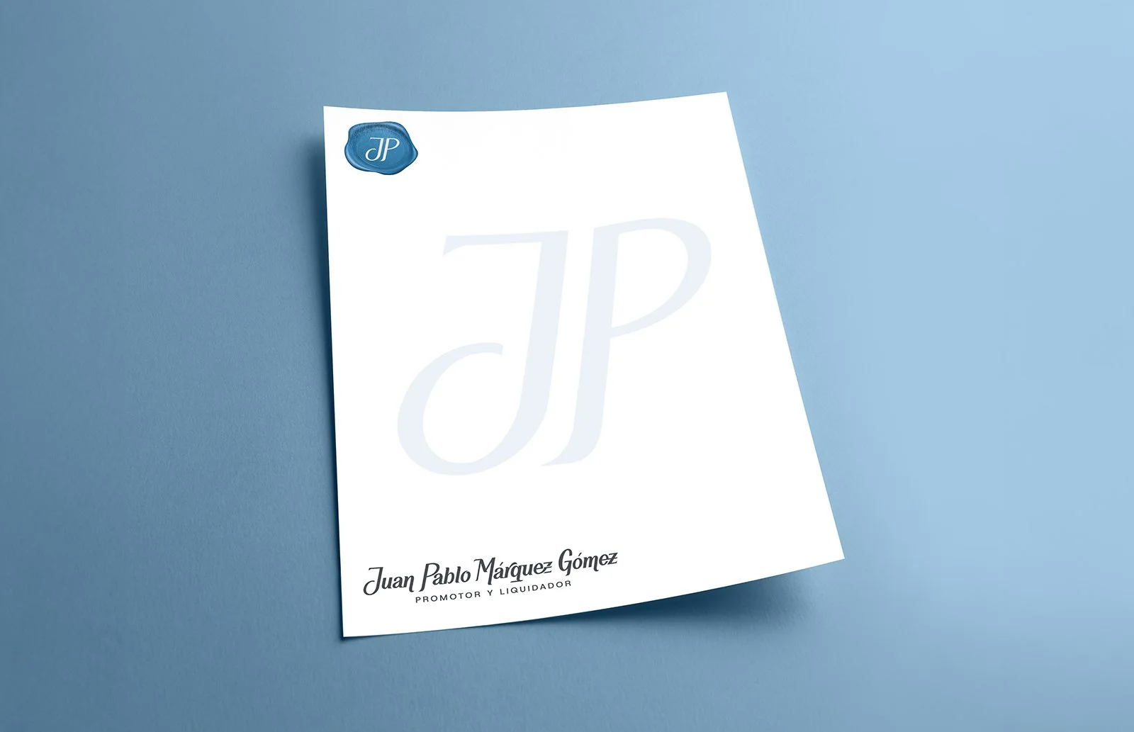
By investing in a bespoke identity, Juan Pablo now possesses a brand system that communicates profound trust and personal integrity. The dual-purpose design ensures he presents a cohesive, distinguished front, whether he is promoting his practice to new clients or formalizing an agreement.